Navigate me to:
Fidelity Investments
Bill Pay Upgrade
Role: Lead UX & UI Designer
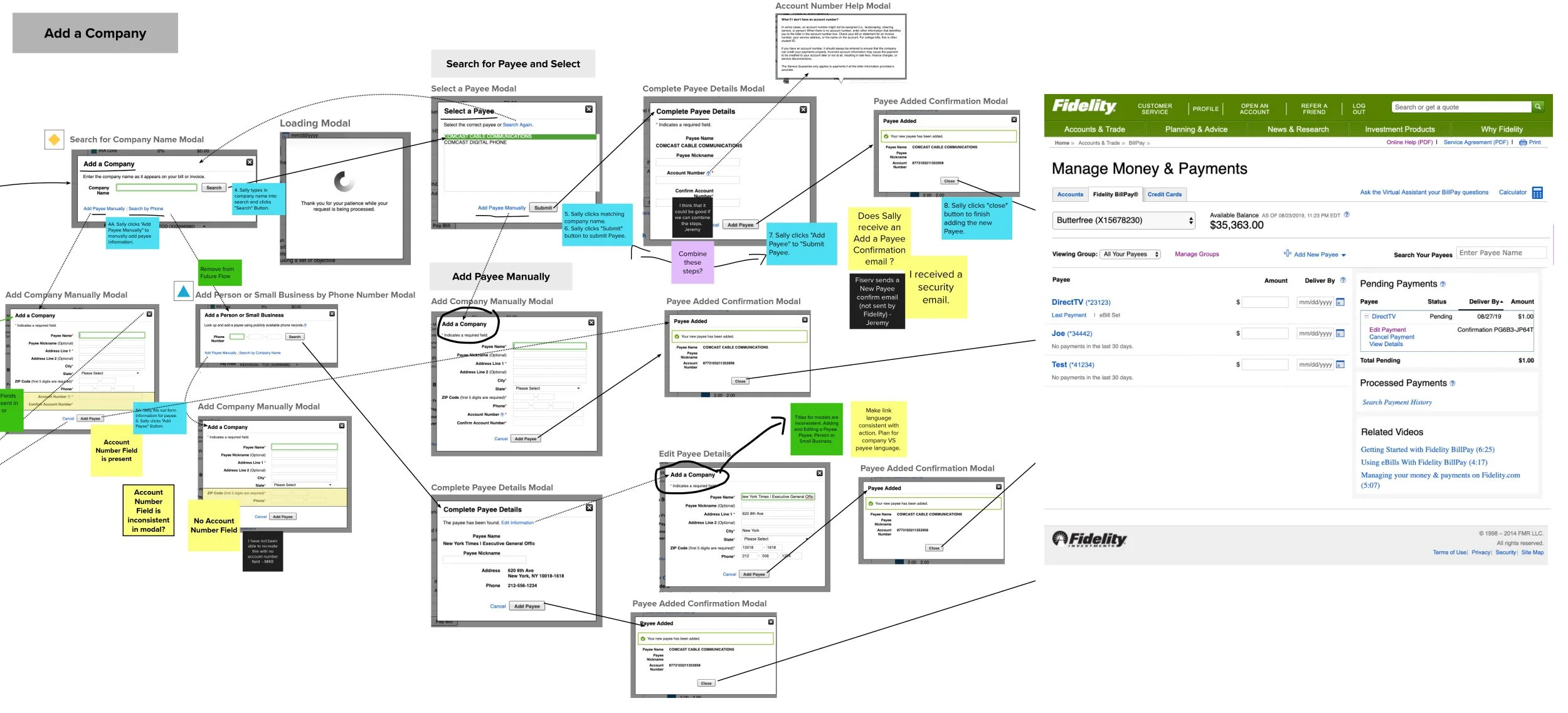
Fidelity’s Bill Pay system required a fast-tracked migration from a legacy platform due to end-of-support deadlines. The existing experience was outdated and lacked clear information architecture, limiting usability. While expanding functionality, the redesign needed to feel modern without disrupting the expectations of a smaller, but affluent, tenured, and vocal user base.
Problems to solve
Fidelity Bill Pay was migrating from a legacy platform to new technology under tight deadlines, as the existing system was nearing end-of-support. The project involved close collaboration with partner Fiserv to ensure full compliance with U.S. financial regulations set by the FDIC and SEC. Its information architecture is limiting and its user experience is dated. With the upgrade, some existing features need to be removed and new improvements could be added, but new functionality is not within scope.
Customer base Research
Although Fidelity’s Bill Pay customer base is smaller compared to other products; Its customers tend to be affluent, tenued, and vocal. The challenge was to introduce a design with a modern look that doesn’t disrupt the day to day expectations of the Bill Pay customer.
UX Solutions
I started with analysis of the experience in order to find areas of improvement and establish the team’s fluency with the platform and UX design process. To meet deadline requirements I recommended bringing in a Junior UX Designer and established extensive cross-team collaboration. Below are highlights of key actions I took in the project.
-
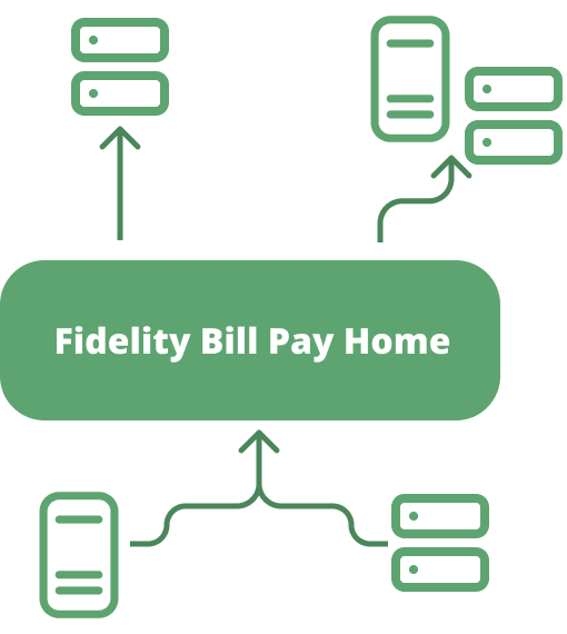
I reorganized the information architecture, expanding it from two main pages with multiple user actions to four distinct categories for user actions.
-
I conducted usability testing on the redesign and new ePayments feature, which identified key areas to enhance in the updated UX.
Some findings:
Confirmations on user actions and payment confirmations are important.
Users want to see an expanded history with an advanced search feature.
User are concerned about losing pending payments or history when payee is deleted.
-
I integrated marketing language and branding into the enrollment experience to clearly communicate the benefits of the Bill Pay platform to users.
-
ePayments functionality increased user retention on the Bill Pay platform, so I highlighted it to drive future enrollment.

-
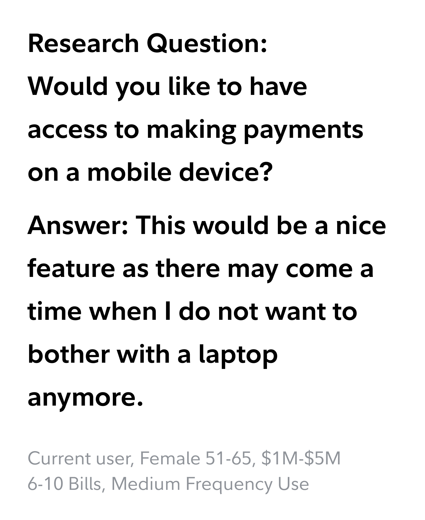
I updated the platform to align with current UX design trends by implementing mobile-first solutions and establishing responsive design.

-
I created a sticky Total Bar that functioned like a “Shopping Cart” for Bill payments.

UX Artifacts
Below are some example screens of UI work for pages within the experience. The upgrade is currently live and continues to follow up with a respond and react periods and iterate with improvements through user testing.

Dashboard/Homepage
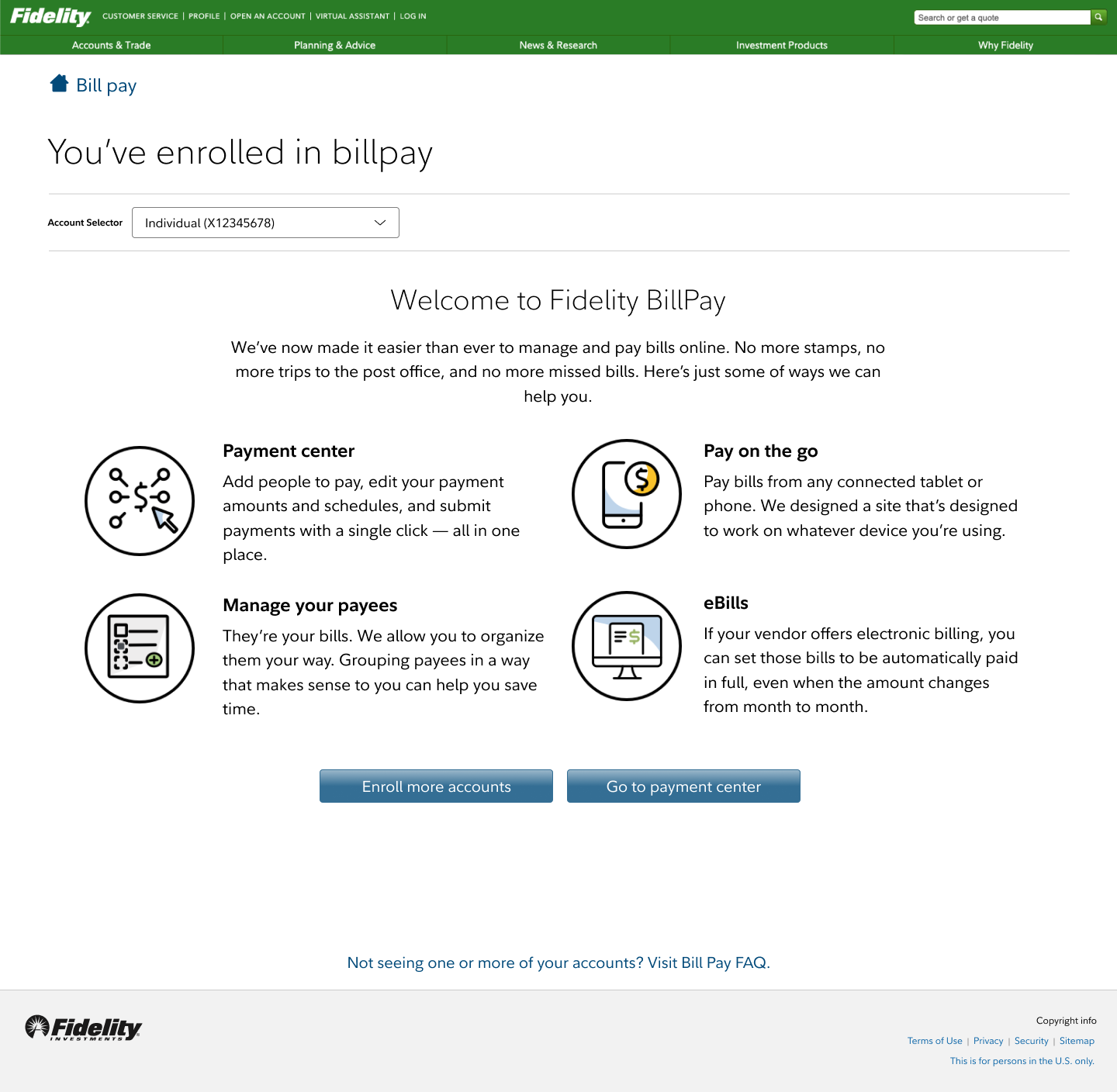
Enrollment Confirmation Page

Mutli-payment Confirmation Page


